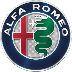
In the world of car manufacturers, Alfa Romeo’s well-known badge stands out as an example of heraldic symbolism. Each aspect of the emblem, designed by Giuseppe Merosi in 1910, is significant to the company’s origins and history. Even though the badge has changed many times over the last century, it has retained its basic and instantly recognisable design.

The current logo of Alfa Romeo, unveiled in 2015
The Italian car manufacturer’s logo is actually compiled of two heraldic symbols. The leftmost half of the circular badge exhibits the coat of arms of Milan, the city where the company established its operations in 1906. This coat of arms is a red cross on a white background, and is used by the city to this day.

City of Milan
On the right of the badge a green serpent can be seen, with what appears to be a forked tongue protruding from its mouth. However, on closer inspection this is in fact not a tongue, but a person! This easily overlooked detail forms part of a heraldic image known as the biscione, or viper. The biscione was the emblem of the House of Visconti, one of Milan’s oldest and most powerful dynasties (not unlike the Medici’s of Florence). The Visconti coat of arms can still be seen on many of Milan’s prominent landmarks.

The Visconti arms above the entrance of the San Gottardo church, Milan

Once again above a gate at the Sforza Castle
While it is certain that the biscione depicts a serpent in the act of consuming a human, who exactly the human is remains disputed. There are two legendary accounts of the emblem’s origins. According to Alfa Romeo, the founder of house of Visconti, Ottone Visconti, adopted the symbol after crusading in the Middle East. Having fought and defeated a Saracen noble, Otone annexed the symbol which his Saracen foe bore on his shield as his own, as was the custom at the time. This symbol was a snake devouring a man. Another origin story explains that a voracious serpentine monster once lived in a lake near Milan. The creature terrorised all who swam in the lake, ate child bathers and poisoned the water with its foul breath. One day, Ottone Visconti confronted the monster and slayed it in combat. In commemoration of this famous feat, Ottone subsequently took the serpent as his personal coat of arms, depicting it in the act of devouring a child.
According to an official press-release from Alfa Romeo, the serpent is not eating the man (Saracen or bather, who knows?) but the man is in fact emerging from the serpent and being reborn. Personally, this smells to me of political correctness, yet it is understandable that a well-known company would be hesitant to associate its brand identity with such morbidity.
Here are three other facts about the Alfa Romeo badge:
- The very first logo featured only the word ALFA, which was an acronym for Anonima Lombarda Fabbrica Automobili, the company’s original name. Romeo was only added in 1915 after businessman Nicola Romeo acquired the company.

The first Alfa [Romeo] badge
- Subsequent badges adopted the basic design that we know today, but featured two additional figure of eight knots in the badge’s blue border. These knots are associated with the royal House of Savoy, which ruled Italy at the time

A comparison of Alfa Romeo badges throughout history. Note the figure-eight knot from 1910 to 1925.
- The silver border added to the 1925 redesign also has symbolic meaning. The Alfa Romeo P2 racing car won the inaugural Automobile World Championship in 1925 (a precursor to the current Formula One competition) and it was decided to commemorate this victory by adding a silver wreath around the perimeter of the badge. This design feature has been omitted from recent badge redesigns.
Pingback: The Ferrari badge and its origins | anapophist