4 Military symbols in national flags

In a previous post, I commented on the relationship between weaponry and history.  The history of the world is punctuated and propelled by conflict, of which weapons are the tools.  Indeed, empires, states and nations rise and fall by the sword.   It is therefore little wonder that military symbols are frequently encountered in national flags.  Such symbols are incorporated as a reference to the martial power and prowess of a state, which underpins freedom and independence in a world dominated by power politics and conflict.  Implicitly, this alludes to the duty of patriots to take up arms in defence of their country.  Also, military symbols in flags often reflect the heritage of a particular nation or state by incorporating traditional weapons.  This post considers four military symbols that appear on national flags as heraldic elements.


Swords

The sword is perhaps the most well-known symbolic representation of power and authority.  Apart their use in flags, the evocative symbolism of the sword is frequently employed in other contexts of power.  Throughout history, the crown jewels of many monarchies and kingdoms have included a sword, along with other artefacts such as crowns, sceptres and orbs.  Particularly in Europe, such a sword is known as a ‘sword of state’ and  symbolises the power of a monarch to use the might of the state against its enemies and the duty to preserve thus right and peace.

https://i0.wp.com/bilddatenbank.khm.at/images/500/SK_WS_XIII_17_12977.JPG

The Reichsswert (Imperial sword) of the Holy Roman Empire made for the coronation of emperor Heinrich IV in 1084

Another famous symbolic use of the sword comes in the form of the Roman goddess of justice, Iustitia, who is these days perhaps better known as ‘lady justice’.  Customarily, she brandishes the sword of punishment in her right hand, while balancing the scales of justice in her left hand.

Dublin Castle Gates of Fortitude and Justice 05.JPG

Sculpture of Justice by John van Nost the Younger. The popular depiction of lady justice blindfolded only became commonplace after the 15th century

In the world of flags, swords are most commonly encountered in the flags of the Arab world.  The sword is usually representative of the curved bladed swords and scimitars traditionally used in the region, such as the Arabian saif or Persian shamsir. 

Flag of Saudi-Arabia, 1938-1973

Flag of Saudi Arabia.svg

Flag of Saudi-Arabia, 1973-present

Flag of the Mutawakkilite Kingdom of Yemen.svg

Flag of Yemen, 1927-1962

The flag of Oman also incorporates a bladed weapon in the form of a khanjar, which is a traditional dagger with a curved blade and distinctive sheath.

Flag of Oman.svg

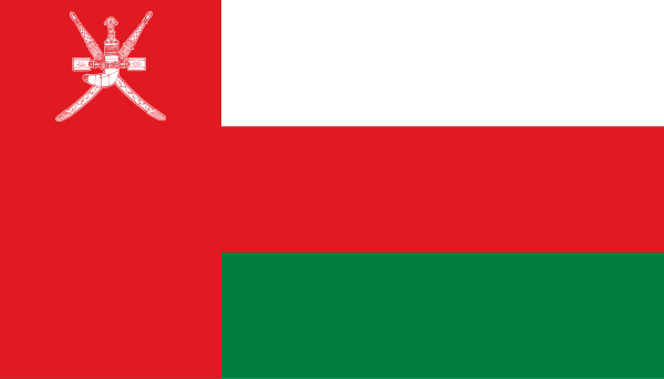
Flag of Oman, 1995-present

https://i0.wp.com/coyotespaw.com/images/links/147-weapons_w13det1.jpg


Shields

The shield is an ancient and popular heraldic element that is frequently used in coats of arms and other emblems.  The use of shields as distinctive charges on flags, similar to swords in the Arab world, is largely encountered in a specific geographical area, namely sub-Saharan Africa.  The use of shields in African flags is also an expression of heritage and ethnic identity, since African shields differ markedly in shape and construction from those historically used in other parts of the world.

COLLECTIE TROPENMUSEUM Schild TMnr 2416-250.jpg

African shields are usually comprised of a wooden frame covered with dried animal hide. This type of shield is commonly associated with the Zulu nation, where it is known as isihlangu

This type of shield is used prominently in the flag of Swaziland, which borders South Africa.  Like the Zulus, the Swazis are part of the Nguni people who immigrated from central Africa to settle in the continent’s southern regions approximately 600-700 years ago.

Flag of Swaziland.svg

Flag of Swaziland, 1968-present

Flag of KwaZulu (1981-1994) which was proclaimed by the apartheid government as a homeland for the Zulu people in South Africa

Flag of Kenya.svg

Flag of Kenya (1963-present) which depicts a Maasai shield

Another type of shield that was formerly used on a national flag is the distinctive Basotho shield, which appeared on the flag of Lesotho between 1987 and 2006.  The current flag replaced the shield with another traditional Basotho symbol in the form of a Mokorotlo or grass hat.  The new ‘demilitarised’ flag was adopted on the 40th anniversary of Lesotho’s independence and was designed to symbolise ‘a nation at peace with itself and its neighbours‘.

Flag of Lesotho, 1987-2006

Flag of Lesotho.svg

Flag of Lesotho, 2006-present


Firearms

As we have seen, in most instances where weapons are used as symbols of nationality and identity they are specifically traditional, since traditional weapons  convey a dual message of power and heritage.  As a result, modern weaponry of recent design rarely feature as heraldic charges on flags.  One notable exception is the flag of Mozambique that famously features a Kalashnikov assault rifle.

Flag of Mozambique.svg

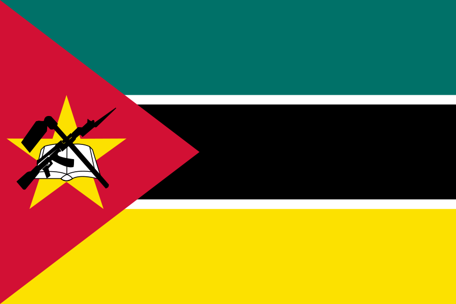
Flag of Mozambique, 1983-present

The symbolic meaning of the AK-47 rifle harkens back to Mozambique’s struggle against Portuguese colonists.  Between 1498 and 1975, Mozambique was known as Portuguese East Africa.  The crossed Kalashnikov and agricultural hoe superimposed on a star allude strongly to the Soviet hammer and sickle – an apparent homage to the triumphant Mozambican liberation movement’s (FRELIMO) Marxist ideological roots.  In 2005, the country held a competition to redesign its flag as part of a long process of reconciliation between FRELIMO and RENAMO.  After independence from Portugal, these two local groups had been embroiled in a devastating civil war until 1992.  During the competition, RENAMO had argued that the Kalashnikov is the main bone of contention in the current flag and that, more than any other element, it should be removed from the flag since it connotes with conflict (a rationale not unlike that which prompted the removal of the shield from Lesotho’s flag at roughly the same time).  A NY Times article from 2005 spoke to FRELIMO sources about the symbols:

The Kalashnikov, they say, is but a coincidentally Russian symbol of Mozambicans’ determination to defend their land; the star merely signifies solidarity with Africans.  If Mozambique’s single star were to symbolize Communism, Joaquim Chissano, the nation’s president for 19 years, said, the Stars and Stripes would place the United States among the world’s most leftist nations.

I’m not entirely sure about Chissano’s reasoning on that point.  Regardless, the flag eventually remained unchanged, despite the 160-odd designs that were submitted during the competition.

It would be incorrect to say that Mozambique is the only state to feature a firearm on its national flag.  The Guatemalan flag sports pairs of crossed rifles and swords, albeit not as prominently as that of Mozambique’s Kalashnikov.

Flag of Guatemala.svg

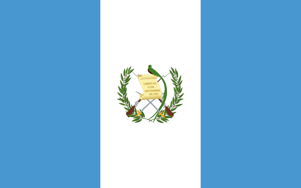
Flag of Guatemala, 1871-present

In Guatemala’s case the rifles appear to be of a generic type and are not specifically described in the Presidential decree that outlines the flag’s design.  Similar to the Mozambican flag, the rifles have bayonets attached. Incidentally, the two blue sections of the flag represent the fact that Guatemala is situated between two oceans, the Pacific Ocean and the Atlantic Ocean.  In Guatemala’s case, the combination of weaponry also symbolises the willingness to fight for liberty and independence.


Medals

To my knowledge, only one state can boast the honour of having been decorated with a medal for bravery.  Throughout its history, Malta’s strategic location in the Mediterranean has meant that it was viewed as an important prize in conflicts and conquest in the area, particularly as a naval base.  Hence, the Maltese islands have, at various times, been ruled by Phoenicians, Romans, Moors, Normans, Sicilians, Spanish, French and British, as well as the Knights of St. John who were a Catholic military order active during the crusades.

Location of  Malta  (Green circle)– in Europe  (green & dark grey)– in the European Union  (green)  –  [Legend]

Malta is stragegically located in the Meditteranean between Europe and Africa

After the conclusion of the Napoleonic wars in 1814, Malta was ceded by France to Britain.  During WWII, the islands were fiercely contested by the German and Italian navies and air forces on the one hand, and the Royal Navy and RAF on the other.  The German offensive in North Africa which begin in 1940 considerably raised the stakes around the occupation of Malta. The Axis aimed to bomb Malta into submission, effectively laying siege to the islands between 1940 and 1942.  As a result, Malta was one of the most heavily bombed areas of the entire war and the three years it spent under assault became known as the ‘Siege of Malta’.

In 1942, King George VI awarded the George Cross to Malta as a collective decoration, in recognition of the bravery of the Maltese people in the face of the Axis onslaught.  The George Cross is Britain’s highest gallantry award for civilians.  Its military equivalent is the Victoria Cross.

gc-vc

The George Cross (L) and Victoria Cross (R) depicted on two commemorative British stamps

In letter, dated 15 April 1942, George VI wrote the following:

The Governor

Malta

To honour her brave people, I award the George Cross to the Island Fortress of Malta to bear witness to a heroism and devotion that will long be famous in history.

George R.I.

Accordingly, since 1943 the bicolour Maltese flag has displayed the George Cross, fimbriated in red, in its canton in commemoration of this award.

Flag of Malta.svg

The flag of Malta, 1964-present. The design was altered slightly from the 1943 version

Of course, since the George Cross is a civilian award, one could argue that it shouldn’t be included in this post dealing with military symbols.  Yet, I think that its inclusion is warranted, based on the fact that it was bestowed for civilian courage during war-time and therefore, as with swords, shields and rifles, bear testimony to a nation’s resolve to resist oppression.


Have I missed any other examples of military symbolism in flags?  Please leave your comments and suggestions below.


Back to the Future: Ranks and Insignia of the Canadian Armed Forces

It is seldom that the specialised and somewhat esoteric topics of military ranks and uniforms become mainstream news.  A hierarchy of military ranks and their accompanying insignia is a uniquely functional system which reflects the structure and function of armed forces.  Yet, at the same time rank insignia remains a semiotic system (i.e. a system that employes signs to convey meaning).  In this regard, rank insignia acquires a symbolic dimension, which is reinforced by the military proclivity for tradition, pride, esprit de corps and camaraderie.  Thus, when such ‘loaded’ symbols are subject to alteration and change it is often the case that there may be resistance from people who associate closely with those symbols, thereby making such changes controversial (and therefore newsworthy).  In this regard, an interesting  example is the reconfiguration of rank insignia in the Canadian Armed Forces, which occurred in 1968 and again presently.

Canada was an important constituent of the British Empire and its successor, the Commonwealth of Nations.  Its military traditions are therefore closely related to that of the British armed forces, as noted in a previous post.  Until 1968, the Royal Canadian Airforce, Royal Canadian Navy and Royal Canadian Army were three separate entities, each with their unique organisation, traditions, identity and commands.  All three of these services had been largely modelled on their British counterparts, particularly in terms of rank structure, insignia and uniforms.  However, the autonomous and organisationally uncoordinated functioning of the three services had been viewed as sub-optimal and wasteful, and pressure steadily mounted to unify the services in order to achieve cost savings and provide improved command, control, and integration of the military forces.

In 1968, the three separate services were reorganised and unified to form the Canadian Armed Forces (no “royal” prefix).  The unification resulted in significant organisational and structural changes, with many commands being abolished and the creation of new, unified positions.  The three services now became three branches, consisting of the Mobile Command (later renamed Land Force Command), Maritime Command and Air Command.  Standardised uniforms were also part of the 1968 unification, with a new design adopted across all three branches to replace the largely British-style uniforms of the individual services.  Initially, and highly controversially, a unicolour rifle green uniform was adopted across all three branches.  This was eventually changed to the current configuration of branch-specific uniform colours, illustrated below:

Lieutenant-General Lucas, Vice-Admiral Robertson, and Lieutenant-General Caron

A photo featuring the post-1968 pattern standardised uniform of (L-R) Air, Maritime and Land Command.  Note the broad golden cuff bands, indicating general rank.

The new uniforms featured redesigned rank insignia, departing from the British system and introducing gold braid cuff bands across all officer ranks and retaining shoulder insignia only for general ranks.  The universal cuff bands insignia closely resembled that of the merchant navy, which was an unpopular decision because it did not reflect the martial dimension of either of the three branches, nor was it relevant to the Air and Land Commands.

canadian_military_ranks_insignia_officerscanadian_military_ranks_insignia_flag_officersThese changes in uniform and rank insignia combined to form an aesthetic that was symbolically neutral and generic.  The loop on the naval officers’ cuff insignia (referred to as an executive curl) was reintroduced in 2010, as pictured above, thereby distinguishing the rank insignia from the other two branches and returning to a traditional combat (as opposed to merchant) naval design.

In 2011, a new wave of change began as a result of which the three branches reverted back to their old names of Royal Canadian Navy, Royal Canadian Air Force and Canadian Army.  A significant component of this return to tradition was the adoption of a new set of rank insignia, replacing the universal system used across all three branches.  In the case of the Air Force and Army, the new insignia is basically a reversion to the well-known British pattern of ranks, which would have been worn by Canadian soldiers during conflicts such as WWII.

canaranks

Below are two official portraits of Lt.Gen. Yvan Blondin, former Commander of the Royal Canadian Air Force, showing the old and new rank insignia:

https://i0.wp.com/www.forces.gc.ca/assets/FORCES_Internet/images/about-L1-pages/rcaf-lgen-yvan-blondin.jpg

The old insignia. Note the solid gold cuff band, indicating all ranks of general. The shoulder insignia indicates the specific general rank as Lieutenant-General.

https://i0.wp.com/www.rcaf-arc.forces.gc.ca/assets/AIRFORCE_Internet/images/portraits/lgen-blondin.jpg

The new insignia. The solid gold cuff band has been replaced by RAF-style bands (one broad, two narrow) designating the rank of Lieutenant-General. The detail on the shoulder ranks are now silver, instead of gold.


The new Canadian army rank insignia also reintroduced the red gorget patches for senior ranks, which are worn on the lapel of the uniform collar.  The new army insignia is illustrated below using two portraits of Lieutenant-General Marquis Hainse, Commander of the Canadian Army.

https://i0.wp.com/everitas.rmcclub.ca/wp-content/uploads/2013/09/Hainse_LGen_Marquis.jpg

The old rank insignia, which is identical to that of the Air Force. The rifle green of the uniform distinguishes it as that of the army.

https://i0.wp.com/www.army-armee.forces.gc.ca/assets/ARMY_Internet/images/about-army/commander-lgen-hainse.jpg

The new rank insignia, which does away with the cuff bands and reintroduced both shoulder ranks and gorget patches.


As with the unification of 1968, the Canadian Forces’ return to pre-1968 rank insignia is in large part a political initiative.  The minister responsible for the 1968 reforms (Paul Hellyer) was part of the liberal government of the time under the long-standing leadership of Pierre Trudeau.  The latest reforms have occurred under the conservative government, under Prime Minister Stephen Harper.  Thus, the reforms are an interesting indication of liberal and conservative sentiments towards military tradition.  It also serves to emphasise the importance of symbolism to the military, and how symbols can be either divisive or unifying.  Indeed, symbolic changes aimed at unification and reconciliation are often the very source of further division and animosity.  However, in the case of the most recent changes in the Canadian Forces, the return to British-style insignia is a defensible and justifiable move that reflects Canada’s close relationship with Great Britain – a proud and illustrious history which was purged during the 1968 reforms.


Aircraft Insignia – A Century of Circles

The armed forces of most contemporary (coastal) states typically consist of three branches, namely that army, navy and air force.  Of these three branches, the army and navy are usually the oldest, with the air force being a 20th century addition.  Thus, air forces adopted various naval elements into their organisation and culture, probably by virtue of their utilisation of “craft” which bear a nominal similarity to “ships”.  As such, air force ranks commonly mirror their naval counterparts, as well as organisational parlance such as “squadron” or “air fleet”.  Moreover, unlike the army, of which the backbone is traditionally the infantry, navies and air forces are primarily dependent upon their respective crafts (whether aircraft or ships) in the fulfillment of their duties.  Needless to say, the identification of such craft is therefore a vital component of commanding and conducting military operations that involve aircraft or seagoing vessels.  Since time immemorial, ships have employed flags as a primary means of identification, notable among which are naval ensigns that serve as alternate national flags.  However, for obvious reasons, the use of flags on aircraft is unfeasible.

The lack of high visibility identification on early military aircraft immediately presented a problem during the opening months of WWI, which was the first conflict in which aircraft played a significant role.  Naturally, it was impossible for troops on the ground to accurately identify airplanes belonging to either friend or foe (not least because aircraft bore no markings at all during that stage) which resulted in indiscriminate ground-fire from troops.  At the beginning of the War, only the French Aeronotique Militaire had adopted standardised aircraft markings, specifying their precise shape size and colour (with Romania also adopting a roundel shortly afterward).  The emblem they chose was a roundel in the colours of the French national flag, the Tricolore, in blue, white and red, which hearkened back to the cockades worn by infantry during the Napoleonic wars.

https://upload.wikimedia.org/wikipedia/commons/2/27/Nieuport.jpg

A WWI French Nieuport biplane with the roundel markings clearly visible on both sets of wings.

https://i0.wp.com/www.militaryheritage.com/images/21shako.jpg

An example of an infantry shako sporting the French national cockade (circa 1815)

In late 1914 the Royal Flying Corps (predecessor of the RAF) followed the example of their French Allies and adopted red, white and blue circles that reversed the French roundels order of colours and established the emblem which (in differing forms) has distinguished British military aircraft for the past century. Of course, in the case of the RAF the colours reflect those of the Union flag.  Prior to following the French in adopting a roundel, the British has painted the undersides of their aircraft fuselages with the Union Jack. This proved to be a short-lived practice, since at altitude its design was often confused by ground troops for the German Iron Cross.

Many pilots were sceptical about the adoption of roundels, given the similarity of its design with that of a bullseye.  They argued that adorning one’s plane with targets for the enemy to aim at was no way to stay alive in the air.  Nevertheless, with the progression of the 20th century and the rapid emergence of air forces across the world, roundels became established and standardised as a primary form of aircraft insignia.  Given their widespread adoption, roundels exhibit an interesting variety in design.  Many European states, who were among the first to establish air forces, copied the French and British approach in their roundels, by including the prominent colours of the national flag in concentric bands:

Belgian Air Component

Royal Danish Air Force

Italian Air Force

Romanian Air Force

Other states have opted to exhibit their national colours, but through non-circular designs.  Such designs are often chosen when two or more countries share the same primary colours:

Irish Air Corps

Indian Air Force

Royal Netherlands Air Force

Royal Air Force

Several air forces display national symbols in a circular roundel, rather than geometric shapes:

Singapore Air Force

South African Air Force

Luxembourg Army Air Component

Flygvapnet roundel.svg

Swedish Air Force

Some have adopted non-circular roundels, such as the German Luftwaffe which has traditionally used a stylised version of the Iron Cross as its emblem.  The German roundel pictured below is that of the current Luftwaffe of the Bundeswehr, and should not be confused with that of the Wehrmacht, which was technically a Balkenkreuz (bar cross) with straight flanks.

Mexican Air Force

Indonesian Air Force

Brazilian Air Force

German Luftwaffe

Another widely used design emerged in WWII when the U.S. Army Air Forces (the precursor to the USAF) adopted a circular emblem flanked by bars in 1943.  The rationale behind the design was that shapes are more easily identifiable over long distances than colours, and at there was confusion between the roundels of U.S. and Japanese aircraft in the Pacific Theatre. At that stage the U.S. was using a white star with a red centre disk against a blue background. The removal of the red centre disc and the addition of two bars served to eliminate any similarities in both shape and colour to the markings (Hinomaru) used by the Imperial Japanese Air Force.

United States Air Force

Republic of Korea Air Force

Panamanian Public Forces National Air Service

National Air Force of Venezuela

Apart from fulfilling its original military purpose, since the 1960s the RAF roundel has been assimilated into the popular consciousness through pop art and Mod culture.  Furthermore, a surprising number of recognisable and high-value brands also use logos that resemble roundels, for example Lucky Strike, Target, Pepsi, LG, Texaco, Tide, the London Underground and BMW.

The Who Logo

One of the most influential bands of the 60s, The Who, adopted the RAF roundel as their logo. The band was at the forefront of Mod culture during its heyday.

BMW stands for Bayerische Motoren Werke and its roundel shows the checkered colours of the Bavarian flag from whence the company originates. The logo has been portrayed as the movement of an aircraft propeller with the white blades cutting through a blue sky, alluding to BWM’s original business of manufacturing aircraft engines.

The contemporary role of roundels in military aviation is largely redundant, owing to the supersonic speeds of fighter aircraft and the fact that enemy aircraft are now targeted by radar and infrared homing missiles far beyond the pilot’s line of sight. As a result, most air forces now use so-called “low visibility” markings , not for visual camouflage but primarily for the purpose of avoiding missiles that target infrared signatures.  These low visibility markings are applied in low-infrared paints and coatings used to cover the entire fuselage that deter the conversion of heat (both from engines and the rays of the sun) into infrared radiation.

Note the low-visibility roundel below the cockpit on this Swedish JAS 39 Gripen.

The Luger P08 – A Rather Interesting Object

I consider weaponry to be instrumental to history.  That is, if history is considered to be an ongoing process, then weapons are the instruments that facilitate that process.  Furthermore, if the present is considered to be a product of history, then historical weaponry may be considered part of the means by which civilisation has reached its current state – for better or for worse.

Consider, for example, that Rome conquered the Mediterranean hinterland (and beyond) by the edge of the gladius and the piercing tip of the pilum; that the English routed the French at Agincourt in part through the devastating use of the longbow; and that when HMS Dreadnought was commissioned into service in 1906, she simultaneously revolutionised naval warfare and rendered every other battleship in the world instantly redundant – contributing significantly to the frenzied pre-WWI arms race.

gladius

The standard Roman infantry weapon – the gladius

HMSDreadnought

HMS Dreadnought

Indeed, there are many examples of military weaponry that may be cited as being important (perhaps even defining) to the course of history.  However, many more may be added to this list, not necessarily because of their momentous impact, but merely by virtue of being considered interesting.  One such weapon is the Luger P08.

Over the last century the Luger has become an iconic pistol, probably by virtue of the fact that its form is distinct and instantly recognisable.  Yet it differs not only in shape from many contemporary pistols, but also in operation. Whereas the overwhelming majority of pistols employ a slide (which fits over the barrel) that recoils when a round is fired, the Luger utilises a “toggle lock” that bends similar to one’s knee-joint.  This significant difference in engineering allows the Luger to have a distinctive profile and shape that sets it apart from most other handguns.  The pistol’s designer, Georg Luger, adapted the toggle mechanism from an earlier pistol, the Borchardt C93 (which he had also helped to design).

ktalz

Demonstrating a Luger toggle lock action

But the Luger is interesting for another reason.  The pistol was the first firearm to utilise the ubiquitous 9mm Parabellum cartridge.  The name derives from the diameter of the bullet (9mm across) and the Latin phrase para bellum, which translates to “for war”.  This reveals the fact that both the Luger pistol and its associated 9mm ammunition were designed for military purposes.  The very first Luger models appeared in 1900 (although designed to use a 7.65mm cartridge).  It was only after the German military showed interest in the pistol and requested a more powerful cartridge that the 9mm round was developed and adopted for use.  The Luger was first adopted by the Kaiserliche Marine (Imperial German Navy) in 1906, followed by the Deutsches Heer (Army) in 1908.  The designation Luger P08 is derived from the German word pistole, and the year in which the pistol was adopted by the army; 1908.  There were three main variations of the Luger during this time, distinguished by 8″, 6″ and 4″ (20cm, 15cm and 10cm) barrels.

DSCN4633

A four-inch barreled Luger manufactured in 1914 with its 7 round magazine and extra ammunition (9mm calibre ammunition also commonly known as “9mm Luger”)

The 6″ version was used by the navy, while the 8″ version was used by artillery troops and was issued with a wooden butt-piece/stock that could be attached to the pistol grip.  The long-barreled artillery version was intended to function as a carbine, being more accurate and stable by virtue of its stock and lengthened barrel, for specific use by troops that were not stationed on the frontline and therefore did not require the firepower of a sub-machine gun or rifle.  However, by far the most common version of the Luger was the 4″ barrel that was adopted in large quantities by the army and became, along with the Mauser C96, the standard issue infantry sidearm during WWI.  By WWII, the primary Wehrmacht sidearm was the Walther P38, although Lugers were common in the field and were still being manufactured.  Despite its close association with the German military, the first country to adopt the Luger was in fact (and somewhat ironically) Switzerland, in 1900.

Artillery LugerP08

An example of an 8″ barreled “artillery Luger”. Note the drum magazine (holding 32 rounds) and the detachable stock.

The distinctive appearance and historical provenance of the firearm has endeared it to show business, where Lugers regularly feature as “character” firearms, frequently used by villains or similarly sinister figures.

800px-Tswlm-luger1

A Luger featured in the opening credits of The Spy Who Loved Me (1977) in which the supervillain is played by an ominously named megalomaniac German called Karl Stromberg

800px-APSWSM-LUGER-1

Two decades later the Luger duly appeared in Austin Powers: The Spy Who Shagged Me (1999), brandished here by another German villain, Frau Farbissina

FMF02

Bean (voiced by Michael Gambon), the antagonist  in Fantastic Mr Fox (2009), uses an artillery Luger that is immediately identifiable by its svelte appearance

A Luger is therefore an artifact that far surpasses an inadequate label or description such as “gun”.  It is simultaneously a witness to a century of historic conflict; an ingenious feat of engineering; and attests of an aesthetic quality that has enabled it to nestle in the popular imagination.  As such, it satisfies all the criteria that would make an object “collectible”, even though it was conceived as an instrument of violence.   Just as the name “Dreadnought” has been appropriated as a metonym for describing armoured warships in general, so too the Luger has transcended its original function.  It may be appreciated for its own sake (i.e. not for its functionality) in which case it more closely approximates art than instrument.  Certainly, I cherish a Luger not because of its utility (as a soldier would), but rather because I find it to be in many ways rather interesting (as a dilettante historian).

Dressed to Kill

Much of the anticipation and planning related to a wedding is usually concerned with the bride and her dress.  Usually, this leads to the bride (quite rightly) being regarded as the focal point of a marriage ceremony, with her dress representing not only the fulfillment of her childhood dreams, but also serving as a tangible and lasting reminder of the special day.  In contrast, many grooms are less concerned with their wedding day attire, and normally opt for a conventional suit or tuxedo.  Some choose to wed in traditional dress (for example grooms of Scottish ancestry) or military uniform, if they are serving members in the armed forces.

The most notable wedding of the last several years is, without a doubt, that of Prince William, Duke of Cambridge, and Catherine Middleton – or Will and Kate, as they are sit-comically known.  Since I do not profess to be an expert on wedding gowns, this post will spend some time looking at the uniform William wore on his wedding day.

W+CTunic

The scarlet tunic has been a conspicuous trademark of the British infantry since the middle of the 17th century.  It appears as if the now famous choice of red was inspired more by economy than valour, since the pigment used to achieve the distinctive shade of red dye was relatively easily sourced from the madder plant (rubia tinctorum) before the advent of synthetic textile dyes.  The “red coat” (a term that became synonymous with the British infantryman) was officially replaced by the more practical and demure khaki drill uniform in 1902, which saw service in the South African (Boer) War between 1899 and 1902.  Khaki was better suited to the climate and geography of many British colonies and offered better camouflage properties.  The latter is itself representative of the evolution of infantry weaponry, since accurate, breech-loading rifled firearms and smokeless ammunition made individuals easier to target in combat.  Previously, infantry were grouped in mass formations in the field of battle for the purpose of discharging volleys of musket fire at the enemy – a strategy that favours numbers over accuracy (and also produced vast clouds of black powder smoke).  Nevertheless, the red tunic was retained for formal and ceremonial occasions, hence its use during the royal wedding.  William’s particular choice of uniform was that of an officer in the Irish Guards regiment.

Rank, insignia and decorations

It was generally expected that William would have chosen to marry in the ceremonial uniform of the Royal Air Force, since he is currently serving as a Flight Lieutenant in the RAF Search and Rescue Force.   In fact, William could have elected to don the uniform of either of the three branches of the British armed forces, by virtue of his enrollment and commission in the Army, Navy and RAF.  However, between the services his highest rank is that of Colonel in the Irish Guards – a ceremonial appointment granted to him by his grandmother, the Queen in 2011.  As explained in a previous post, the rank of colonel in the British Army is represented by two stars and a crown, which William wears on his shoulder epaulettes.  The uniform’s affiliation to the Irish Guards is readily visible by the embroidered shamrock on either side of the tunic collar, as well as the arrangement of the buttons in two rows of four, reflecting the regiment’s position as the fourth most senior Guards regiment.  The regimental badge of the Irish Guards also reflects the regiment’s origins in the form of a  St. Patrick’s cross (the patron saint of Ireland) and a shamrock.  The regiment’s motto is Quis Separabit?, which translates to “who shall separate us?” (a coincidental and appropriate sentiment on the occasion of a wedding).

irish guards badge

Regimental badge of the Irish Guards.

The red sash worn around the waist is made of silk and was traditionally worn by officers and NCO’s as means of distinguishing them to their troops in the field of battle.  The blue sash worn over the shoulder is part of the insignia of the Most Noble Order of the Garter, as is the star worn on the lower left breast of the tunic.  The Order of the Garter is the highest order of chivalry and the most prestigious honour of the United Kingdom.  Membership to the order (members are referred to as Knights or Ladies companion) is conferred exclusively by the monarch as a personal gift and the order may have no more than 24 members at any given time, excluding members of the royal family.  On the sash, nearer the shoulder, William wears the wings of the RAF as a reference to his current service as a pilot.  The single medal pinned to the Garter Sash is the Queen Elizabeth II Golden Jubilee Medal that was awarded in 2002 to commemorate the fiftieth anniversary of the Elizabeth’s accession to the throne.  Subsequent to the wedding, in 2012, he was awarded the Diamond Jubilee Medal in the sixtieth year of Elizabeth’s reign.

Cap, trousers and boots

The conventional ceremonial headgear of the Irish Guards is the well-known bearskin hat that is word by all five the Regiments of the Foot Guards.  Perhaps for reasons of practicality, William opted for the regiment’s alternate black officer’s cap. The cap features gold embroidery on the visor, signifying officer rank.  The traditional black trousers feature the traditional red stripe, echoing the scarlet tunic.  On the occasion of his wedding, William also chose to wear spurs on his boots.  These spurs are also conferred by the monarch to male recipients as part of the insignia of the Order of the Garter, and alludes to the previously mentioned fact that they are styled as Knights Companion.

Thus, this royal groom’s attire, perhaps more so than that of the bride, deserves closer scrutiny – its provenance is most certainly richer and more interesting than that his better half!

The Flags of Scotland

With the recent passage of the Scottish independence referendum, it is an opportune time to take a look at that most recognisable symbol of Scotland’s (known as Alba in Scottish Gaelic) national identity namely its flag – the distinctive white saltire on a blue field.

1000px-Flag_of_Scotland.svg

In 2003 the Scottish Parliament specified the official colour of the flag using the international colour coding system and it was decided that the white saltire should appear on a bluebackground known as Pantone 300.

The legendary origins of the flag dates back to the Battle of Athelstaneford in the year 832, fought between the Picts and the Angles.  The Picts were a tribal people who inhabited the northern parts of what is today known as Scotland, whilst the Angles were invaders of German origin who, together with the Germanic Saxons, had established numerous kingdoms in what is today known as England.  The toponym England is itself derived from Angle (as in land of the Angles) and is still reflected in contemporary regional names such East Anglia.

250px-Asterixpicts

The Pictish people make their debut in the latest adventure of Asterix.

Prior to the Battle of Athelstaneford, the Pictish King Oengus II (variant of the modern name of Angus) was visited in a dream by St Andrew after praying for victory to the saint, for whom the Oengus and his followers had a cult-like reverence.  The king pledged that, if granted victory over the Angles, he would proclaim St Andrew as the patron saint of his kingdom.  It is written that during the battle in which the Picts were heavily outnumbered, a white cross of clouds formed against the blue sky, signifying St Andrew’s blessing of the Pictish cause, that struck divine fear in the hearts of the Angles and inspired the Picts to victory.  Since the martyrdom of St Andrew through the process of crux decussata the diagonal cross (heraldically a saltire) has become associated with the saint and, subsequently, Scotland.

The flag in its current form was reportedly first flown in 1512, making it the oldest continuously used flag in Europe.  Of course, since 1606 the Scottish saltire on a blue field also constitutes part of the Union Jack of United Kingdom of Great Britain and Northern Ireland.

450px-Gotein_(Gotein-Libarrenx,_Pyr-Atl,_Fr)_tableau_La_Crucification

A painting of the crucifixion of St Andrew, from a cathedral in Gotein-Libarrenx, France. Note the crux decussata that inspired the Scottish saltire.

The issue at the heart of the 2014 Scottish referendum was whether Scotland should continue to be a part of the 307-year old Union.  In answering the unambiguous question on the ballot of 18 September (Should Scotland be an independent country?) 55.3% of Scots voted no.  Thus, the Union endures, and the British monarch is still nominally the head of state in Scotland.  Because of this fact, Scotland also has an addtional flag in the form of its own royal standard, which was traditionally used by the King of Scots (until 1603) and thereafter by the Sovereign of the United Kingdom.

Lionrampant.svg

The Scottish royal standard, described in simple heraldic terms as a red lion rampant on a yellow field

The lion rampant (i.e. poised on its hind legs) was long a symbol of Scottish kings, and was subsequently adopted as part of the royal standard.  Since the Union, the Scottish royal standard also features in the the Royal Standard of the United Kingdom, where it is represented as a quarter, along with the standards of Ireland and England.  The Scottish standard is flown at royal residences in Scotland when the monarch is not in residence (the UK Royal standard is flown when in residence).

In a poll related to the referendum, the U.K. Flag Institute asked its members whether the Union Jack should be changed if Scotland were to become independent, to which 64% responded positively.  Of course, seeing that Scotland will now remain part of the Union, the design of en ex-Scotland Union Jack remains a matter for creative conjecture.  Accordingly, several designs of varying suitability were accordingly hypothesised, including these below:

_71502906_union-like-(2)

The Union Jack without the Scottish flag, of which the blue is replaced by green to represent Wales

However, as Alex Salmond concedingly remarked, the issue of Scottish independence has been settled for a generation.  Nevertheless, while the saltire will not soon fly as a symbol of a ‘free’ Scotland, it still represents the proud people who assert themselves as a distinctive nation, inspired by a formidable and resilient heritage.

A guide to military officer ranks

A previous post spent some time introducing the hierarchy and function of military ranks.  This entry is devoted to exploring the basic characteristics of the various commissioned officer ranks in a typical armed forces organisation.

As note previously, officers are those individuals in an armed force that exercise the authority of the head of state, through means of a commission.  Officers exercise leadership and battlefield initiatives through a chain of command that carries orders from superior officers (higher ranking) to subordinates (lower ranks) who are typically enlisted personnel.

Consider the table below, comparing officer ranks between three different armies’ ground forces (click to enlarge):

Capture

The examples illustrated above represent three popular and well-known systems of officer rank.  That of the US Army is well-known throughout the world, possibly due to the publicity the armed forces receives through the American film industry.  The US rank system is used only by that country and, as can be seen above, incorporates symbols unique to its national identity (such as oak leaves and eagles).

The Canadian system is derived from that of the United Kingdom, and is also employed by various commonwealth armies including India, Australia, New Zealand and South Africa.  The UK system is the mostly widely used rank structure in the world.  In commonwealth countries where the Queen is no longer head of state, the crown is often substituted with an applicable national symbol.

The Russian system is different from the preceding examples, not only in symbolism, but also in structure.  This rank structure employs three different grades of lieutenant, whilst it omits a brigadier equivalent rank.  The Russian format is followed by most former Soviet republics (e.g. Ukraine) and certain Marxist/communist influenced states (e.g. North Korea).

Regarding the varied use of symbolism, it is interesting to note the usage of stars across the three systems of rank.  Whereas the US reserves stars only for general officers, the Russian system utilises stars for all its officer ranks.  The Canadian/commonwealth pattern uses the four pointed star of the Order of the Bath (a British order of chivalry) which is commonly referred to as a “pip” when it appears on military rank insignia (for a discussion on  Canadian rank insignia, click here).  The US pattern is further distinguished from the Russian and Canadian examples in that most of its ranks do not “stack” the same symbols on top of each other to denote progression in seniority, and each rank has its own unique symbol (the exception being the general ranks, which stack the five-pointed stars to indicate seniority).  In the commonwealth system, general ranks are indicated by a sabre crossed with a baton (the baton is a symbol of command authority).  However, in the United Kingdom, a brigadier is not considered a general rank and as such it does not display a sword and baton, but rather three pips and a crown (one pip greater than a colonel).

UK_Army_OF6-2

Brigadier [UK]

General officers are one of three categories that are used to refer collectively to officer ranks.  General ranks are those ranks that typically contain the term “general”, which refers to the general nature of the command these officers exercise (being at the apex of the rank hierarchy).  Field officers typically refer to those officers that command large/combined units and formations in the field of battle, and include brigadiers, colonels (including Lt.Col.) and majors.  Junior officers refer to the lowest officers grades that are usually responsible for commanding smaller individual formations on the field of battle, such as a company or platoon.  Together, these officers and their respective grades consitute the chain of command that makes organised and effective warfare possible.

SovietFieldCommandpost

A Soviet army major (which is a field rank) issuing commands from his battlefield HQ. He is most likely commanding a battalion.

Military ranks: An introduction

The Pulitzer prize-winning journalist, Charles Krauthammer, remarked in 2010 that:

“Clashes of values and the struggle for primacy constitute a constant in human history that accounts for that other constant – conflict and war”

Even though Krauthammer was commenting on contemporary US foreign policy, his insight applies to the entirety of human history – and, if it is true that history is written by the victor, then our shared history is necessarily a product of conflict.

At the risk of oversimplifying, it may be posited that attaining success as a country is a result of being good at warfare.  Such military success may result from various factors, not least of which are firepower (think Hiroshima, Nagasaki) and sheer numbers (the Soviet Red Army).  However, these virtues of military power are not shared equally amongst nations – not all countries have aircraft carriers (in fact, only ten countries have at least one in service) or 2,3 million man armies (such as the Peoples’ Liberation Army of China).  Nevertheless, discrepancies in firepower and numbers may be mitigated by an army that is disciplined and organised for, as Socrates noted:

“A disorderly mob is no more an army than a heap of building materials is a house”

One of the most effective way to organise, command and control any group of people is to establish a hierarchy that circumscribes authority, fixed roles and responsibilities.  In armed forces around the world, this hierarchy has become an established feature in the form of military ranks.  In any military organisation, personnel and their accompanying ranks may be distinguished according to two categories, namely:

  • Officers – Those individuals that exercise authority via a commission (see example below).  A commission is a document that charges an officer with specific duties and responsibilities, and is issued in the name of the head of state (e.g. the President or King).  It can therefore be said that officers exercise the direct authority of the head of state and, as such, must be obeyed accordingly.  Historically, the officer corps was drawn from nobility and aristocracy, resulting in a clear class distinction between them and other soldiers.  This is no longer the practice and officers are expected to undergo intensive training in order to develop leadership and decision making skills and are often university graduates.  Officer ranks span from Lieutenant (most junior) to General (most senior).
BritishArmyOfficer

Officer ranks of the British Army (click to enlarge).  Many other countries also follow the British system of military ranks. Note that the army is only one component of a typical armed forces, which usually consists of an army, navy and air force.

c147920

An example of an officer’s commissioning scroll issued during the Civil War. The commission is issued in the name of the President of the USA and is accordingly signed by Abraham Lincoln

  • Enlisted personnel  – These individuals comprise the majority of military personnel in an armed force and can be further delineated according to two categories, namely non-commissioned officers (NCO’s) and other ranks.  NCO’s are enlisted personnel who under the command of an officer are granted delegated authority to supervise other soldiers for specific purposes.  NCO’s are often referred to as the “backbone” of an army, and serve as a link between officers and other ranks.  NCO ranks generally span from Corporal to Sergeant.  The remainder of soldiers are referred to as ‘other ranks’ and is usually designated by rank of Private.
Capture

Enlisted ranks of the US Army. Note the progressive addition of chevrons for each rank. The rounded bottoms visible on some ranks are called “rockers”.

The ratio of officers to enlisted men as varied across time and place.  In 1940, the Wehrmacht had one officer to every 33 enlisted men (ratio of 1:33), whilst the British Army during the same time had a officer ratio of 1:8.  The French Army in 1940 (prior to its ignoble defeat) had an officer ratio of 1:4, as did the Italian Army.  It is therefore interesting to speculate that the higher the officer/enlisted ration, the more effective the army. Bearing in mind that in 1940 the Wehrmacht consisted of 4.5 million men and the French Armée de Terre 3,3 million men, the ratio of officers to enlisted men may be depicted as follows:

wehrmacht 1940

Officers to enlisted men. Wehrmacht – 1940

armee 1940

Officers to enlisted men French Armée – 1940

The main advantage of having fewer officers in relation to enlisted men is that orders are communicated much faster through the chain of command onto the battlefield.  Keeping with the example above, for an order to be communicated to 100 German troops in 1940 will involve only three officers (one officer for every thirty-three men) in contrast to the French army, where issuing an order to 100 soldiers will involve a staggering 25 officers (one for every four men)!  The German model is clearly more efficient, provides less chance for miscommunication and can be expedited in less time – all of which were crucial factors in the Wehrmacht’s eventual Blitz of France in the summer of 1940.  However, with modern armies becoming more specialised and concentrated, there is a trend towards a higher officer ratio (e.g. the modern US Armed Forces has a ratio of 1:5.3).

At the end of the day it is true that for any organisation to function there needs to be more people following orders than there are issuing them – the military is no exception.  Accordingly, it is the officers’ duty to identify goals and formulate strategy and, along with the NCO’s, lead the enlisted men in realising those objectives on the field of battle.  This is of course a task of immense responsibility, given the prospect of loss of life and limb in war.

Hip to be square

Flags are essentially banners that denote some form of identity.  Banners, of course, come in all shapes and sizes.  So do flags.  However, all but one of the world’s national flags are four-sided, and a vast majority of those are rectangular. The most common rectangular proportions for national flags are 1:2 (i.e. the flag is twice as long as it is wide) the and 2:3 (i.e. the flag is 1.5 times as long as it is wide).

800px-Flag_of_Zimbabwe.svg

The flag of Zimbabwe. A typical example of 1:2 proportion

800px-Flag_of_France.svg

The flag of France. A well known 2:3 proportion flag.

After conducting a quick count (and providing my arithmetic served me correctly) I calculated that approximately 45% of all countries have a 1:2 proportioned flag, whilst approximately 30% have 2:3 proportioned flags.  The remaining 25% of national flags have other proportions.  3:5 is the next most common, which is a size that slots in between the two dominant sizes.

800px-Flag_of_Germany.svg

Germany’s Bundesflagge is probably the most recognisable 3:5 proportioned flag.

The Star Spangled Banner is in fact a 1:1.9 proportioned flag, which to the naked eye appears identical to a 1:2 flag (such as that of the USA’s former colonial master Great Britain).  In fact, colonial ties play a remarkably influential role in the size and proportions of national flags.  Many former British colonies (such as Zimbabwe, flag pictured above) adopted the flag dimensions of the Union Jack upon attaining independence.  Similarly, many French colonies (of which there are numerous in central Africa) also designed new flags, but retained the Tricolor’s proportions of 2:3.  (A bit of trivia is that Liberia’s flag shares the rare 1:1.9 dimensions with the US flag, given the historical relationship between these states).

Returning to the point made about banners in the opening paragraph, it is remarkable that only two national flags are square!  Surely, when designing a banner (and even a flag) a square is just as viable a choice as that of a rectangle?  Well, apparently not, since the only two states that have square flags are Switzerland and the Vatican City (a square flag naturally has a proportion of 1:1).

Flag_of_the_Vatican_City.svg

The square flag of the Vatican, adopted in 1929

320px-Flag_of_Switzerland_(Pantone).svg

The square flag of Switzerland, adopted in 1889

Of course, apart from being the only states to fly square national flags, these two states share another important historical connection, namely the Pontifical Swiss Guard.  Contrary to popular belief, various European kingdoms have in fact employed Swiss Guards throughout history.  Given its current per capita income (4th highest in the world) it is ironic that for much of its existence Switzerland was a relatively poor state – it is, after all, small, landlocked, mountainous and surrounded by the most powerful states in Europe.  As a result of such limited economic prospects at home, young Swiss men often became soldiers of fortune in the many conflicts of post-medieval Europe (despite their current diplomatic neutrality, the Swiss have a long and illustrious military history).  At one time or another, Swiss mercenaries fought for France, Spain, Napoli, and the Netherlands.  At the Battle of Bailén (1808) between France and Spain both armies fielded a number of Swiss mercenaries who eventually came to blows during the battle.  Their loyalty and competence as soldiers also earned them the trust of many royal courts, where the Swiss were employed as palace guards.  The adoption of Swiss neutrality in 1874 put an end to this practice, with the exception of the Pontifical Swiss Guard in the Vatican, which has protected the Pope since 1506.

VaticanSwissGuards_5694901543_o

A member of the Swiss Guard is sworn in by reciting an oath of allegiance whilst holding the Guard standard (note the distinctive colours employed by both the uniform and flag)

To this day, the requirements for becoming a member of the Pontifical Swiss Guard are strictly adhered to, namely:

  • The candidate must be a male of Swiss nationality
  • He must be of catholic faith
  • He must be single
  • He must be at least 1.74m tall

In my opinion, it is apt that the unique relationship between the Vatican and Switzerland is also shared between the flags of these two states.

The New Zealand Flag Debate

Flags don’t often make for headline news, but when they do it is usually an emotive and controversial issue.  Acknowledging the necessity for change, and subsequently adapting to such change is challenging enough for individuals, but when this situation is extended to a collective (such as a nation / culture) and it affects that most intimate of human facets, namely identity, the possibility of achieving consensus vanishes entirely.

In March 2014, New Zealand’s Prime Minister, John Key, announced that a referendum will be held on whether to change the national flag.  The current flag of New Zealand is a British blue ensign defaced with four red stars, fimbriated in white, in the fly (symbolising the Southern Cross constellation):

800px-NZ_flag_PhotoFlags are unparalleled as media of identity.  No other object or concept can more concisely and effectively convey the complex and loaded message that is carried by a flag.  Of course, this message becomes more loaded and meaningful as time progresses.  New Zealand’s current flag has been in use since 1869 and was officially adopted in 1902, meaning it has served as a symbol of identity for 145 years.  Given this supercentennial age, the flag saw service in the numerous foreign conflicts of the 20th century where New Zealand’s soldiers served as part of the British Empire –  including the disastrous Gallipoli Campaign of April 1915, where 2,721 New Zealanders were killed in action.  As Don McIver, president of the Returned and Services Association (RSA) of military veterans, notes:

“Thirty-two thousand New Zealanders have given their lives under the flag and many more thousands have served under it in a combat environment.”

In a speech regarding the flag issue, Prime Minister Key remarked that:

” … it’s my belief, and I think one increasingly shared by many New Zealanders, that the design of the New Zealand flag symbolises a colonial and post-colonial era whose time has passed.  The flag remains dominated by the Union Jack in a way that we ourselves are no longer dominated by the United Kingdom.”

The Prime Minister is, indeed, correct.  New Zealand’s flag, like any flag to a greater or lesser extent, belongs to an era past.  However, whereas many states have adopted new flags in order to purge a nation of racial or authoritarian legacies, New Zealand’s colonial relationship with Britain is not one that deserves to be relegated to obscurity for the sake of political expediency.  Many of New Zealand’s most enduring contributions in the international arena (which resulted in freedoms that are today taken for granted) occurred under the auspices of the Empire.  This is a legacy to be proud of – one that is eminently worthy of being commemorated and enshrined as part of a national identity.

Prime Minister Key himself has put forward an alternative design for New Zealand’s proposed new black flag that is dominated by a stylised silver fern.  The fern itself is a version of Cyathea dealbata, a plant that is endemic to the island and is officially represented on the state’s coat of arms.  More popularly, it has become the de facto national symbol of New Zealand through its adoption by national sports teams.

619px-Coat_of_Arms_of_New_Zealand.svg

The Coat of Arms of New Zealand. 1956 – present

meadsnz1967blog595

All Black rugby legend, Colin Meads


The current debate surrounding New Zealand’s flag is in fact only the most recent.  During the course of the last three decades, numerous other designs have been forwarded as possible replacements for the blue ensign, most of which have been chronicled here.  However, the simplistic white on black design appears to represent the closest approximation to consensus at this point.  Below are two interpretations of what such a flag could entail:

500px-Silver_fern_flag.svg

The ‘traditional’ silver fern associated with national teams

500px-Silver_Fern_flag2.svg

A highly stylised version of the silver fern


Whilst these designs are not heraldrically offensive or otherwise unsuitable, one must wonder whether it is appropriate for a national identity to be so intimately and exclusively associated with sport.  My plea to those proponents of changing the flag would be to consider the entire (that is, past and future) implication of that such a move would entail.  People, even those opposed to the change, will inevitably grow accustomed to a new flag – it takes but one generation this to occur.  But, just as New Zealand has endured and developed to become a preeminent and permanent fixture of the global political order of states, so too its premier national symbol must (above all else) attest to the achievement of that stability, success and steadfast permanency.